Widget In Detail: FractionallySizedBox
How can You build a responsive Flutter app using Relative values rather than Pixel values?

D
I'm a mobile/web developer 👨💻 who loves to build projects and share valuable tips for programmers
Follow me for Flutter, React/Next.js, and other awesome tech-related stuff 😉
- In order to make an application responsive in Flutter, we have widgets like as MediaQueries, LayoutBuilder, Expanded, Flexible, and so on.
- In this post, we'll look at the FractionallySizedBox widget, which may help you make your application responsive.
When to use FractionallySizedBox?
- We use FractionallySizedBox when we wish to offer relative
height,width,space. - The size of the widgets in the Flutter application is determined by pixel values. The difficulty with utilizing pixel values is that they aren't responsive.
- If you're familiar with CSS. Then, instead of using
px, we mostly userem,em, and other units. Because thepxdoesn't really adjust to thewidthandheightof the screen. - In short, use the FractionallySizedBox widget when you want to give sizes in percentages (%).
How to use FractionallySizedBox?
- FractionallySizedBox is very simple to use. You just wrap the widget within the FractionallySizedBox widget, and then specify the
widthandheightto size the children of FractionallySizedBox. - The main properties of FractionallySizedBox are:
-
widthFactor: It takes
doublevalue as input. Values between ( 0.0 - 1.0). For example0.5means 50% ,1.0means 100%. -
heightFactor: Takes same values as
widthFactor. But forheight. -
alignment: Used to align the
childof the FractionallySizedBox.
-
widthFactor: It takes
- However, utilizing FractionallySizedBox inside a
RoworColumnhas one problem. - The FractionallySizedBox widget must be wrapped inside the
FlexibleorExpandedwidget. - It's because the
widthandheightof the Row or Column are not specified usually. As a result, FractionallySizedBox will be perplexed as to what the parent size is. Because FractionallySizedBox sizes its offspring relatively to its parent at the end of the day. - As a result, be sure to specify a size for the Row or Column, or wrap FractionallySizedBox within the Flexible or Expanded.
- FractionallySizedBox is basically an alternative to MediaQueries. It just makes it easier to write, and that's all there is to it!! Because you can accomplish the same thing with MediaQueries as well. As a result, it is entirely up to you to decide which method to employ.
- FractionallySizedBox is used in many ways, For example, giving a
height,width, orspacebetween two widgets, etc. - Let's take an example.
Use case #1 : Inside the Column/Row
class MyHomePage extends StatelessWidget { @override Widget build(BuildContext context) { return Scaffold( appBar: AppBar( title: Text("FractionallySizedBox "), ), body: Container( width:MediaQuery.of(context).size.width, height:MediaQuery.of(context).size.height, color: Colors.blueGrey, child: Column( children: [ Flexible( child: FractionallySizedBox( widthFactor: 0.8, heightFactor: 0.8, child: Container( color: Colors.orange, ), ), ), Flexible( child: FractionallySizedBox( widthFactor: 0.6, heightFactor: 0.6, child: Container( color: Colors.white, ), ), ), Flexible( child: FractionallySizedBox( widthFactor: 0.4, heightFactor: 0.4, child: Container( color: Colors.green, ), ), ) ], ), ) ); } } 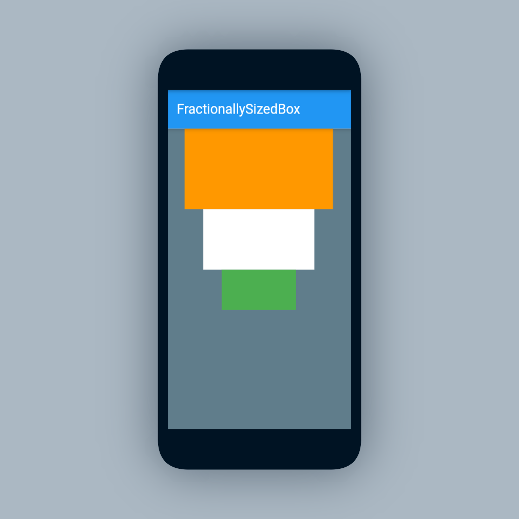
- As you can see, the sizes provided by the FractionallySizedBox are used by all three Containers. Regardless of the screen size, all of these containers will take up the available space.
Use case #2 : For Giving Spacing
- You can also use FractionallySizedBox to give space between two widget like below :
body: Container(
      width: MediaQuery.of(context).size.width,
      height: MediaQuery.of(context).size.height,
      color: Colors.blueGrey,
      child: Column(
        children: [
          Container(
            width: 200,
            height: 50,
            color: Colors.orange,
          ),
          const Flexible(
            child: FractionallySizedBox(
              heightFactor: 0.1,
            ),
          ),
          Container(
            width: 200,
            height: 50,
            color: Colors.white,
          ),
          const Flexible(
            child: FractionallySizedBox(
              heightFactor: 0.2,
            ),
          ),
          Container(
            width: 200,
            height: 50,
            color: Colors.green,
          ),
        ],
      ),
    ),
Use case #3: For Alignment
class MyHomePage extends StatelessWidget {
@override
Widget build(BuildContext context) {
  return Scaffold(
    appBar: AppBar(
      title: const Text("FractionallySizedBox"),
    ),
    body: Container(
      width: MediaQuery.of(context).size.width,
      height: MediaQuery.of(context).size.height/2,
      color: Colors.blueGrey,
      alignment:Alignment.bottomRight,
      child: FractionallySizedBox(
        widthFactor: 0.6,
        child: ElevatedButton(
          onPressed:(){},
          child:Text("Button"),
        )
      )
    ),
  );
}
}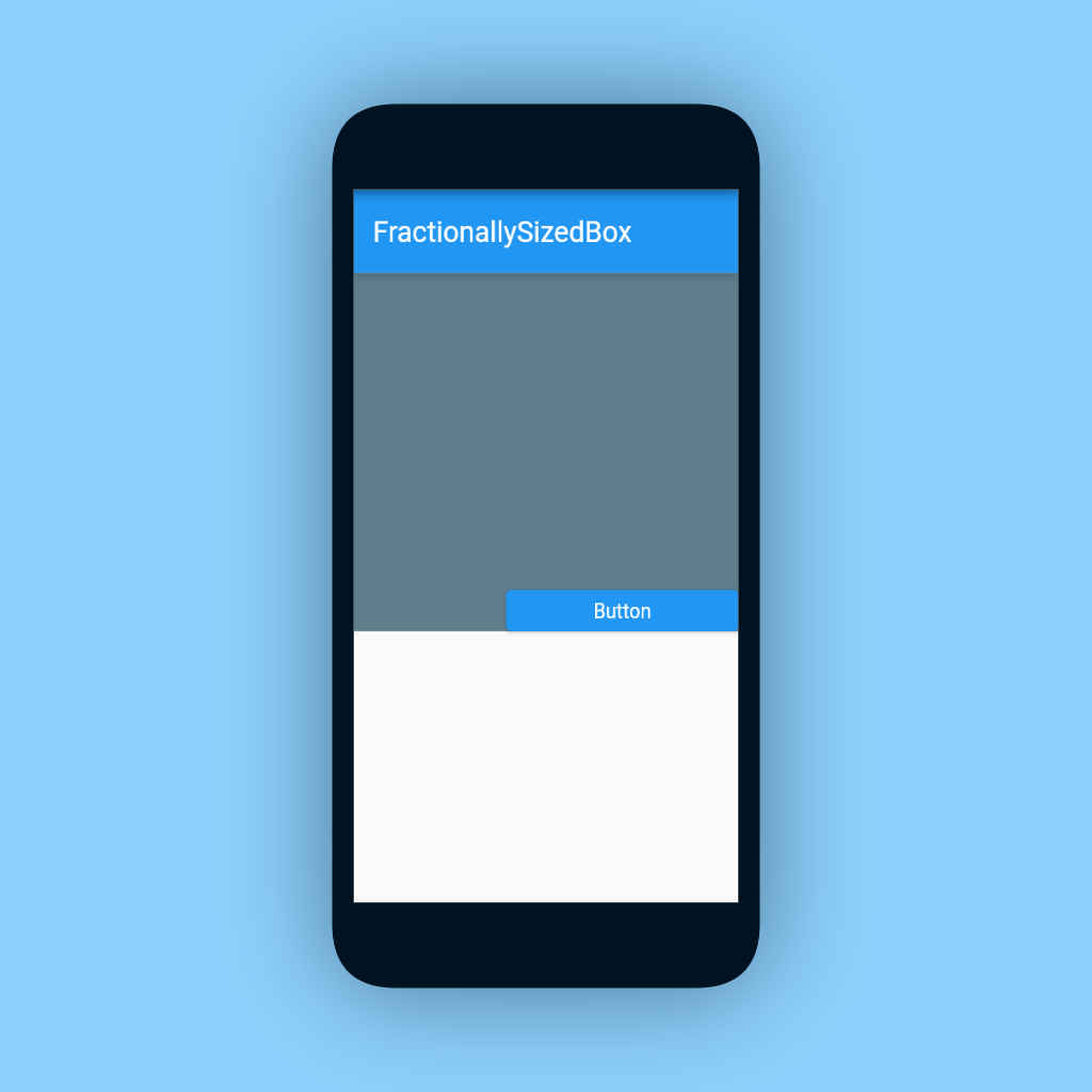
Final Words :
- That's it !! I recommend you to play around with FractionallySizedBox. It will get more clear.
Thank you for taking the time to read this article. 🙏. If you found it useful, please share it with others.
Also, if you have any suggestions, please leave them in the comments section. ✍️ See you soon. Until then....