How to make a PIXEL Perfect Flutter Application?
A Complete Guide on Making a PIXEL Perfect Flutter Application

Introduction
- Creating a responsive application is a critical task for any web/mobile app developer. There are hundreds of such gadgets, each with its own dimensions. And the most crucial step is to fit our app to the device's screen.
- There are numerous classes in Flutter that may be used to provide responsiveness, such as Mediaqueries, LayoutBuilder, ConstraintsBox, and so on.
- Using these widgets to create responsive applications is not a problem, but there is still a lot of boilerplate code.
- So, to make development easier, we'll utilize a package called flutter_screenutil.
- All right, without further ado, let's get started.
What is the Goal?
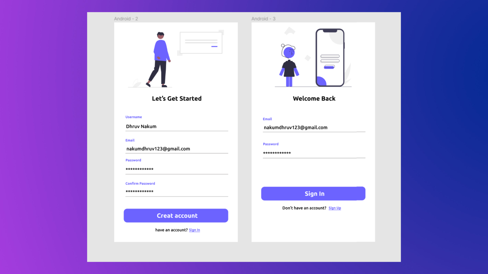
- Essentially, I'm making an app that I designed in Figma. Then, using the flutter_screenutil package, we'll make it responsive.
- The layout is as follows:
Installation
- First of all we need to add flutter_screenutil package to the pubspec.yaml file.
dependencies:
  flutter_screenutil: ^5.0.1
Initialization
- Before we can use this package, we must first initialize it.
- To accomplish this, we must surround the MaterialApp widget with the ScreenUtilInit widget.
@override Widget build(BuildContext context) { return ScreenUtilInit( //..... ); }- We must provide a builder function because it is required. And, if you're following a design from Figma or AdobeXD, as we are in this example, you must also pass the designSize parameter.
- In designSize, we must pass the
widthandheightparameters. By clicking on any of the Frames, you can get the design size. 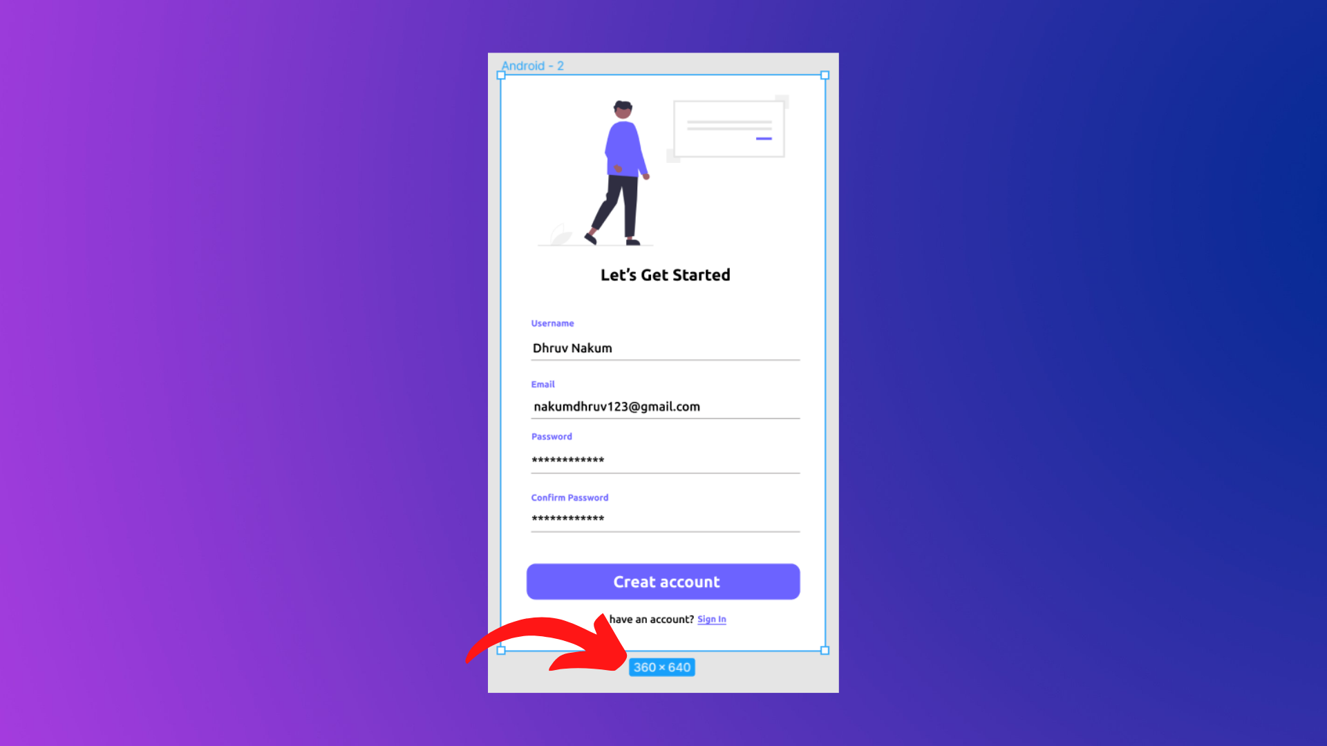
- In our case, the design width is 360 and the height is 640. Now, inside ScreenUtilInit, let's put it all together.
@override
Widget build(BuildContext context) {
  return ScreenUtilInit(
      designSize: const Size(360, 640),
      builder: () {
        return MaterialApp(
          title: 'Flutter Demo',
          theme: ThemeData(
            primarySwatch: Colors.blue,
          ),
          home: const Login(),
        );
      });
}
Designing Login Page
- As we've completed all of the setup for the flutter_screenutil package. This package is now available for use.
- So, let us build a Login Page. Make a file called
login.dart. class Login extends StatelessWidget { const Login({Key? key}) : super(key: key); @override Widget build(BuildContext context) { return Scaffold( body: ... ); } }- As we can see in the design, all of the elements, from the image to the button, are in the vertical direction, or we can say in column. So let's make a column and place the widgets within it.
@override Widget build(BuildContext context) { return Scaffold( body: Column( crossAxisAlignment: CrossAxisAlignment.center, children: [ Image.asset( 'assets/images/sign_in.png', height: 250, fit: BoxFit.cover, ), SizedBox(height: 10), Padding( padding: EdgeInsets.all(18.0), child: Column( children: [ Text( "Welcome Back", style: TextStyle( fontSize: 20, fontWeight: FontWeight.bold, ), ), SizedBox(height: 20), const TextField( decoration: InputDecoration( hintText: 'Email', label: Text( 'Email', style: TextStyle( color: Colors.blue, ), ), ), ), SizedBox(height: 10), const TextField( obscureText: true, decoration: InputDecoration( hintText: 'Password', label: Text( 'Password', style: TextStyle( color: Colors.blue, ), ), ), ), SizedBox(height: 50), SizedBox( width: MediaQuery.of(context).size.width * 0.8, height: 40, child: ElevatedButton( onPressed: () {}, child: Text( 'Sign In', style: TextStyle( fontSize: 18, fontWeight: FontWeight.bold, ), ), ), ), SizedBox(height: 10), Row( mainAxisAlignment: MainAxisAlignment.center, children: [ Text( "Or", style: TextStyle(fontSize: 14, color: Colors.grey), ), SizedBox(width: 10), GestureDetector( onTap: () {}, child: Text( "Sign Up", style: TextStyle( fontSize: 14, color: Colors.blue, fontWeight: FontWeight.bold, ), ), ), ], ), ], ), ) ], ), ); }- The output of the above Login Screen will look like below:
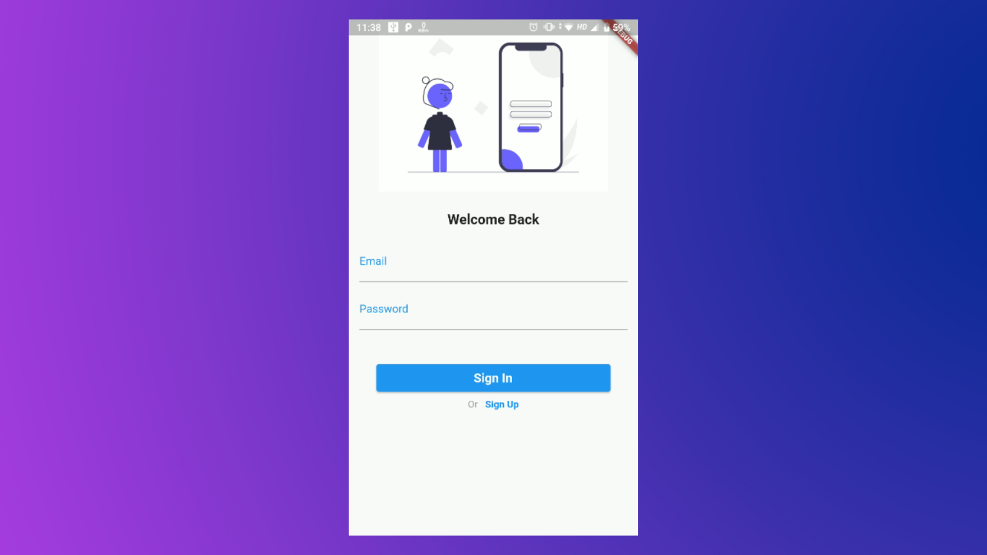
- Now the problem with this is if you try to run this in other sizes of devices, the widgets like Image, Text, Button, etc will not resize themselves according to the screen. In short, it's not responsive.
- So to make the widget size according to the screen size. We can use the
flutter_screenutilpackage.
Making Login Page Responsive
- So, wherever we've set
heightvalues, we need to replace them with (value.h). As an example,// Replace height: 250.0 // To height: 250.0.h - Same goes for
width, For example,// Replace width: 50.0 // To width: 50.0.w - And for the font size you have to add .sp after the value. For example,
// Replace fontSize: 18.0 // To fontSize: 18.0.sp - Let's change all the
height,widthandfontSizevalues of LoginPage. @override Widget build(BuildContext context) { return Scaffold( body: SingleChildScrollView( reverse: true, child: Column( crossAxisAlignment: CrossAxisAlignment.center, children: [ Image.asset( 'assets/images/sign_in.png', height: 250.h, fit: BoxFit.cover, ), SizedBox(height: 10.h), Padding( padding: EdgeInsets.all(18.0.w), child: Column( children: [ Text( "Welcome Back", style: TextStyle( fontSize: 20.sp, fontWeight: FontWeight.bold, ), ), SizedBox(height: 20.h), const TextField( decoration: InputDecoration( hintText: 'Email', label: Text( 'Email', style: TextStyle( color: Colors.blue, ), ), ), ), SizedBox(height: 10.h), const TextField( obscureText: true, decoration: InputDecoration( hintText: 'Password', label: Text( 'Password', style: TextStyle( color: Colors.blue, ), ), ), ), SizedBox(height: 50.h), SizedBox( width: MediaQuery.of(context).size.width * 0.8, height: 40.h, child: ElevatedButton( onPressed: () {}, child: Text( 'Sign In', style: TextStyle( fontSize: 18.sp, fontWeight: FontWeight.bold, ), ), ), ), SizedBox(height: 10.h), Row( mainAxisAlignment: MainAxisAlignment.center, children: [ Text( "Or", style: TextStyle(fontSize: 14.sp, color: Colors.grey), ), SizedBox(width: 10.w), GestureDetector( onTap: () { Navigator.push( context, MaterialPageRoute( builder: (context) => const SignUp(), ), ); }, child: Text( "Sign Up", style: TextStyle( fontSize: 14.sp, color: Colors.blue, fontWeight: FontWeight.bold, ), ), ), ], ), ], ), ) ], ), ), ); }- Now, when you run this on different devices, you'll notice that all of the widget sizes are exactly adjusted to fit the screen of the device.
- Let's see how it looks on various devices :
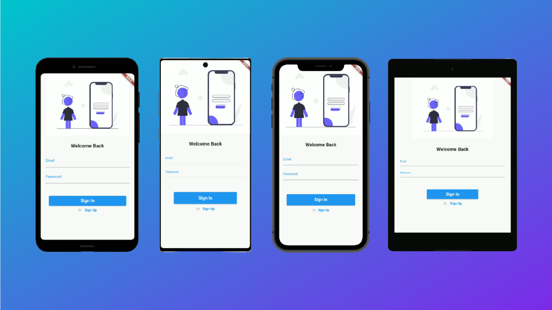

- The same thing applies to the SignUp page. You will receive the following result after designing and adding .h/.w/.sp to the respective height, width, and font size values.
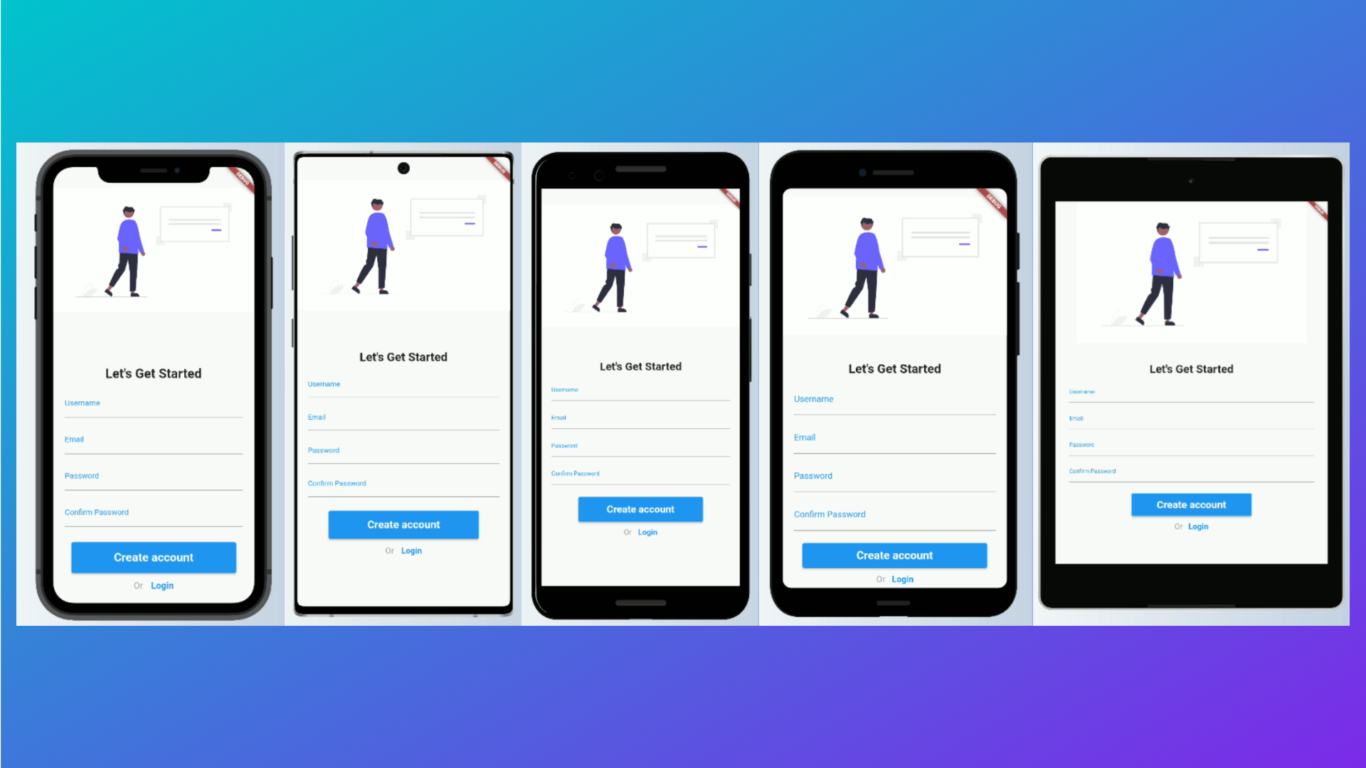
- You can get the full code by visiting :this link
Wrapping Up
- That's All!! This is how simple it is. You may learn more about how this package works under the hook by visiting its GitHub repository.
- I hope you found this article to be beneficial. If you have any feedback/queries, leave them in the comments.
- Thank you for spending time reading this article. See you in the next article. So, until then...


