Animation In Flutter: AnimatedList
Animate The Item of The List when Inserted / Deleted.

- A List is highly important in any application. It may be a list of people, a list of menu items, a list of to-do items, a list of games, and so on.
- And, of course, if there is a List, it can also conduct Insertion and Deletion of an item. For example, consider the Todo application, which allows users to add tasks and mark them as done.

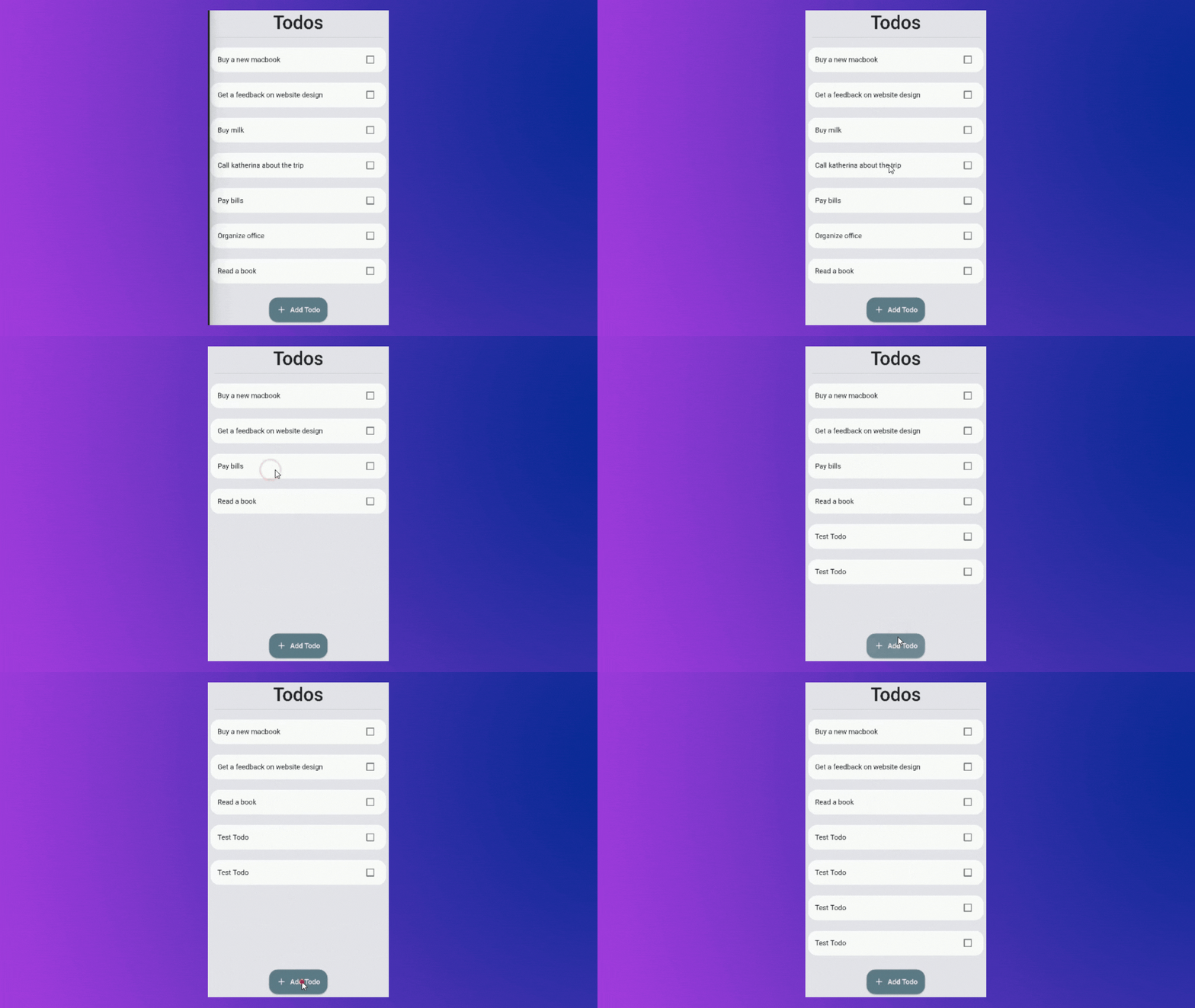
- That's OK. But can you see a flaw? The list just jumps when entering or removing a Todo. And, if the list is too long, we may not be able to identify where the item was entered or deleted.
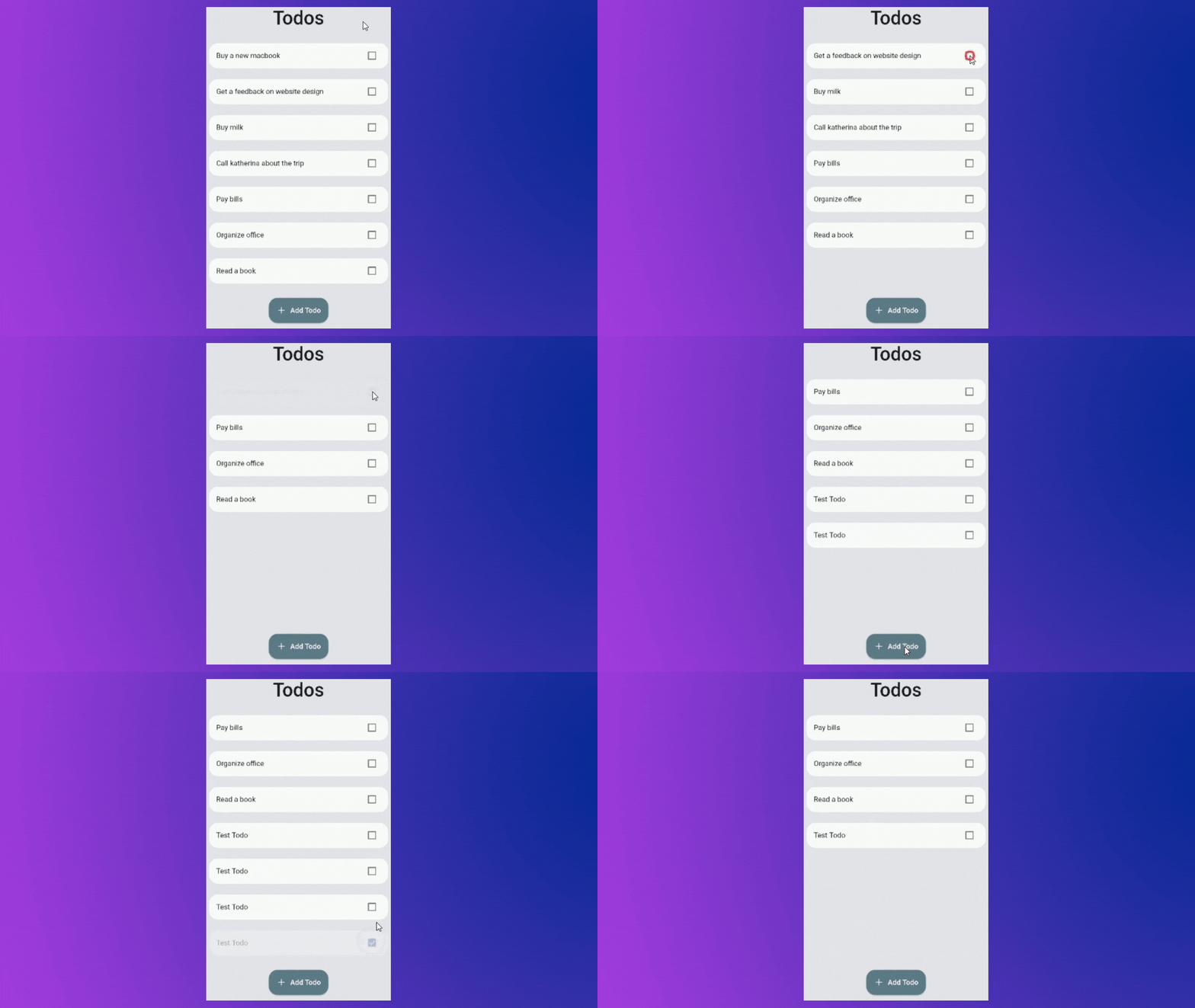
- As you might expect, the solution is to create some type of animation that accomplishes the same purpose but with greater visual clarity.
AnimatedList
- To animate the list, Flutter offers us an incredible widget called AnimatedList.
- Which is, as the name implies, an animated version of a basic ListView. When an item is added or removed from the list, it can animate it.
- Let's use the same Todo app as an example to learn how to utilize it:
- You will find the starter project in the below repository:
Implementation
Replace Listview.builder with AnimatedList
- To utilize 'AnimatedList,' we must enclose the children within it. So let's get this done soon.
- In our case replace
Flexible( child: ListView.builder( itemBuilder: (context, index) => buildTodo(listOfTodo[index], index), itemCount: listOfTodo.length, ), )Flexible( child: AnimatedList( itemBuilder: (context, index, animation) => buildTodo(listOfTodo[index], index, animation), initialItemCount: listOfTodo.length, key: key, ), ) - There are three parameters that we need to pass:
-
itemBuilder: This is where we return the widget that we wanted to display the user. The only difference between it and
ListView.builderis that there is an extra parameter calledanimation. It returns a double animation value. - initiaItemCount: It defines, how many items are in the list initially there in the list.
-
key: This is an essential factor. Because it allows us to insert/delete elements from the AnimatedList. There are two methods for updating the AnimatedList:
-
Using of(context) :
AnimatedList.of(context).insertItem(index);
AnimatedList.of(context).removeItem(index, (context,animation)=> ...) -
Using GlobalKey :
You can create a global key like this :
final key = GlobalKey<AnimatedListState>();.
And then pass it to theAnimatedList's key property.
AnimatedList(key: key)
-
Using of(context) :
-
itemBuilder: This is where we return the widget that we wanted to display the user. The only difference between it and
Using key to update the List and UI.
Now that we've created the Global key and given it to the AnimatedList, we can change the UI by updating our
insertTodoandremoveTodomethods.void insertTodo(int nextIndex, Todo todo) { listOfTodo.insert(nextIndex, todo); key.currentState!.insertItem(nextIndex); } void removeTodo(int index) { final item = listOfTodo.removeAt(index); nextTodoIndex--; key.currentState!.removeItem( index, (context, animation) => buildTodo(item, index, animation), ); }- You may access the
insertItemandremoveItemfunctions by accessing the AnimatedList's currentState. The currentState in this case is aAnimatedState.
Supply animation value to TodoWidget
- Once the insertion and deletion procedures have been implemented. When the user adds or deletes an item, it's time to animate the list item.
- To do this, we must provide the
animationvalue to theTodoWidget. Then we may wrap our Widget in any AnimatedWidget we choose. Widget buildTodo(todo, int index, Animation<double> animation) => TodoItemWidget( todo: todo, animation: animation, // <---Here onClicked: (value) { setState(() { todo.isCompleted = value; }); removeTodo(index); }, );- Now we also have to define this property
animationinside the TodoWidget class.
Final Step
- After initializing and passing the
animationvalue we can simply use that inside any Animation Widget like below: Widget build(BuildContext context) { return FadeTransition( opacity: widget.animation, // <-- Here child: Padding( padding: const EdgeInsets.all(8.0), child: Card( elevation: 0.0, shape: RoundedRectangleBorder( borderRadius: BorderRadius.circular(20), ), child: CheckboxListTile( onChanged: (value) => widget.onClicked(value), value: widget.todo.isCompleted, title: Text( widget.todo.title, ), ), ), ), ); }- Here, I've used
FadeTransitionwhich will Fades In the item when inserted and Fades Out the item when deleted. 
- You can also use different Animation Widgets like :
- SlideTransition,ScaleTransition,SizeTransition,RotationTransition,PositionedTransition,RelativePositionedTransition,DecoratedBoxTransition,AlignTransition,DefaultTextStyleTransition,FadeTransition.
Final Code :
Final Words:
- Thank you for taking the time to read this article. 🙏
- If you found it useful, please share it with others. 🤠
- Also, if you have any suggestions, please leave them in the comments section. ✍️
- See you soon. Until then....


