Animation In Flutter: AnimatedCrossFade
Fade animation between two different widgets and their sizes.

I'm a mobile/web developer 👨💻 who loves to build projects and share valuable tips for programmers
Follow me for Flutter, React/Next.js, and other awesome tech-related stuff 😉
AnimatedCrossFade
- Consider a scenario, where you want to replace a current widget with a new widget.
- For example, you have an app where there are different types of posts. And you want to blur/just place a widget on top of that post saying "This post is sensitive". Just Like Instagram
- Let's make something like this in our Flutter App

- As you can see It's working fine. But the problem is the visibility of the original post when we click on the
Show Mebutton is very quick. It's not smooth. - So to do a fade animation when we replace our Spoiler Alert widget with the original post widget, we can use the AnimatedCrossFade widget.
Using AnimatedCrossFade
- First Lets define the
AnimatedCrossFadewidget in thebody Scaffold( backgroundColor: Colors.blueGrey, appBar: AppBar( title: const Text("AnimatedCrossFade"), ), body: Center( child: AnimatedCrossFade( // .... ) )- AnimatedCrossFade takes two
childrenwidgets that as you might have guessed,firstChildandsecondChild. - So let's give the
Spoiler Alertwidget to thefirstChildproperty because it's the first child we're showing to the user. AnimatedCrossFade( firstChild: GestureDetector( onTap: () { setState(() { isVisible = true; }); }, child: Container( width: 300, height: 400, color: Colors.black, child: Column( mainAxisAlignment: MainAxisAlignment.center, children: [ const Text( "Spoiler Alert", style: TextStyle(fontSize: 18, color: Colors.white), ), const SizedBox( height: 20, ), OutlinedButton( onPressed: () { setState(() { isVisible = true; }); }, child: const Text("Show me")) ], ), ), ), ) )- And now, also give the original post widget to the
secondChildproperty. secondChild: GestureDetector( onTap: () { setState(() { isVisible = false; }); }, child: Container( width: 300, height: 400, color: Colors.blueGrey, child: Image.network( "https://memegenerator.net/img/instances/60138700.jpg") ), ),- Still, it will not do anything. We have two more
requiredproperties i.e -duration - You also have to provide the
durationto theAnimatedCrossFadewidget. Which is used to define for how long the animation will fade from first to a second child. - Let's put
1second AnimatedCrossFade( duration: const Duration(seconds: 1), firstChild : //... secondChild: //.... )crossFadeStateThe last
requiredproperty iscrossFadeState. It is as you might have guessed, thestate, which determines whether to showfirstChildorsecondChildIf it is
CrossFadeState.showFirstthen, when the animation completes thefirstChildwill be shown and vice versa- The child that is shown will fade in, while the other will fade out.
- Now let's conditionally render our two children. For that let's first define a
boolean. bool showPost = false;- And in the
crossFadeStateproperty add the below code : crossFadeState: !showPost ? CrossFadeState.showFirst : CrossFadeState.showSecond,- And THAT'S IT !!
Final Output
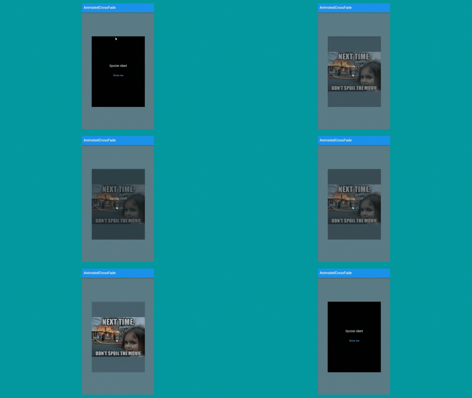
Final Code
layoutBuilder :
- To understand why this property is needed, Let's change the
widthandheightof the Post Image. secondChild: GestureDetector( onTap: () { setState(() { showPost = false; }); }, child: Container( width: 200, // <- here height: 300, // <- here color: Colors.blueGrey, child: Image.network( "https://memegenerator.net/img/instances/60138700.jpg" ), ), ),- Now if you run the app, you'll see a weird jump when we go from the
firstChildstate tosecondChildstate. 
- To fix these types of issues where both the widget have different
heightandwidth. We have to uselayoutbuilderof the AnimatedCrossFade widget. - This has
4parameters i.e : topChild,topChildKey,bottomChild,bottomChildKey.- This
layoutbuilderwill return aStackwidget with twoPositionedwidgets. The first Positioned widget will take thebottomChildwidget and the second Positioned widget takes thetopChildwidget. - Also don't forget to add
alignmentcenter andclipBehaviourto Clip.none. Otherwise, you'll not get the expected result. AnimatedCrossFade( layoutBuilder: (topChild, topChildKey, bottomChild, bottomChildKey) => Stack( clipBehavior: Clip.none, alignment: Alignment.center, children: [ Positioned( key: bottomChildKey, child: bottomChild, top: 0.0, ), Positioned( key: topChildKey, child: topChild, ), ], ), //.... )- OUTPUT :
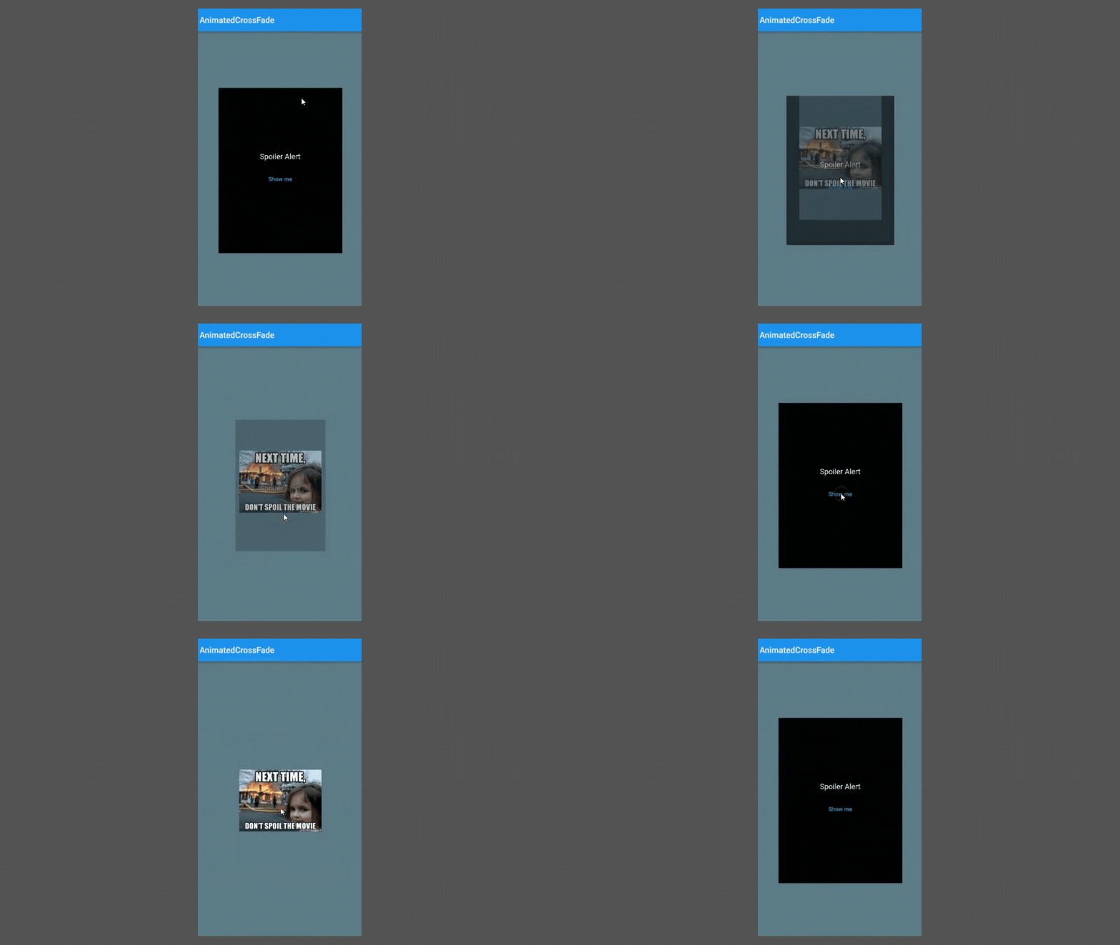
- SEE!!

- Thank you for reading. If you found this article useful then, don't forget to share it with others 🙂.
- Feedback and comments are welcomed ✍️
- See you in the next article. Till then...
